
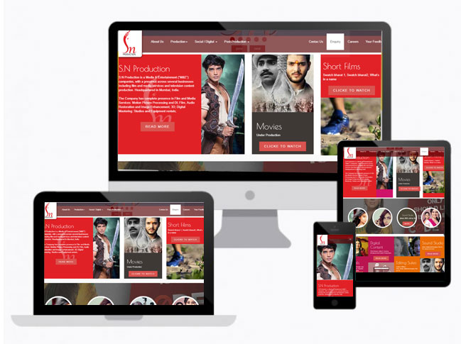
A responsively designed website is built with elements that respond differently when viewed on devices of different sizes. The page “responds to” the device it is being seen on and resizes itself to fit.
What is responsive web design?
Responsive web design is a specific approach in which a designer creates a web page that adapts to the type of device it is viewed through. The same page works on:
- Oversized desktop computer monitors
- Laptops
- Tablets
- Smartphones and iPhones
Winsetinfo is a leading responsive web designing IT company in Delhi, India.
Why responsive design is the need of the hour
Responsive web design is an essential tool for anyone with a digital presence. With the growth of smartphones, tablets and other mobile computing devices, more and more people view web pages on smaller screens.
Responsive websites are friendly to the mobile-first index that Google rolled out in 2018. Businesses now increase their mobile presence through their website, e-commerce store, Google Business page, social media pages and other channels, so that they are easily accessible on every device.
- Users can access your site efficiently from mobile phones, iPhones and tablets.
- Mobile-friendly websites are the current trend, and search engines favour them too.
- You can increase your audience and traffic with responsive website design.
Responsive website design company in Delhi
Winsetinfo is an outstanding responsive website design company in India, with a team of strategic professionals who simplify how you reach your target audience. We use the latest technology to build responsive websites for any device, especially mobile screens, so your site works everywhere.
That is why it is essential to make your online business fully responsive. If you are looking for the best responsive website design company in Delhi, you are in the right place at Winsetinfo India Pvt. Ltd.
One website, every screen. Tell us about your business and we will design a responsive website that looks and works great on phones, tablets, laptops and desktops.